By PRZEMYSŁAW SOLECKI (Predictive Solutions)
A scatterplot, or scatter graph, is a popular diagnostic tool for associations between quantitative variables. It is invaluable in correlation analysis for readily assessing the nature and the shape of the relationship between two variables.
APPLICATIONS OF THE MULTIDIMENSIONAL SCATTERPLOT
The scatterplot is a useful tool in other areas of multidimensional analyses, e.g., in linear regression, when diagnosing outliers, or in order to assess the quality of groups derived, e.g., in cluster analysis.
The scatterplot also performs important presentational functions. With this tool, it is possible to identify groups of objects of similar value, distinguish segments of interest, and describe regularities (or irregularities) present in the data set. It can, for example, be used to present brand position (e.g., based on brand awareness in a market segment), prepare a visualization of the relationship between two variables, or position target groups.
There are numerous reasons to enrich our two-dimensional scatterplot with additional information. A quick and easy way to achieve this is by using the scatterplot’s big brother, the multidimensional scatterplot available in PS IMAGO PRO.
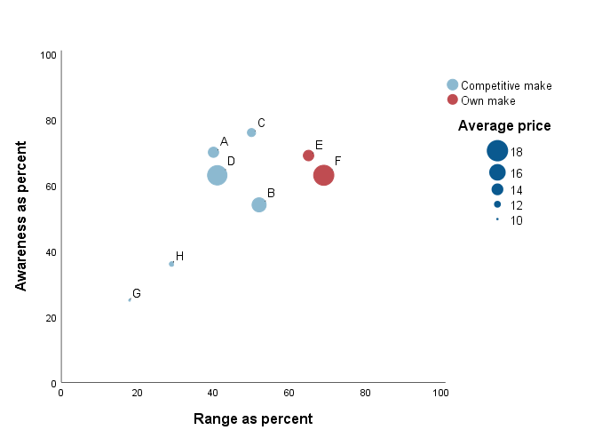
In the multidimensional scatterplot in Fig. 1 we can distinguish our products from competitive products using color, present segments developed in the course of the cluster analysis using the shape of the data points on the chart, and represent the average product price using the relative size of the data point.
Figure 1. Sample multidimensional scatterplot
ADDITIONAL QUALITATIVE VARIABLE ON THE SCATTERPLOT
In one of our other blogs, we used the scatterplot and distribution graph to look for the most favorable offers for used cars. Let’s go back to this example and analyze the offers of a sample car dealer. We have a database containing information about the vehicle brand, age, mileage, type of fuel as well as engine capacity. Let’s try to analyze the dependencies between the vehicle’s age and its price and mileage.
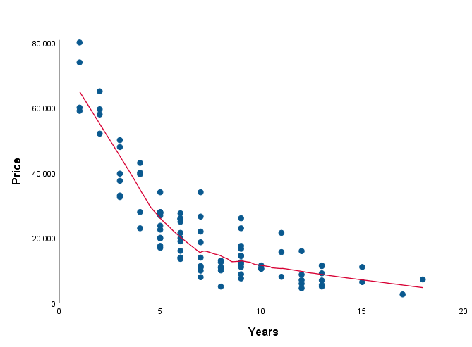
It is not surprising that the vehicle’s age affects its price. The relationship is not surprisingly negative (after excluding vintage cars from the analysis): the vehicle is getting cheaper with age. To assess the nature of this relationship we choose Multidimensional scatterplot located in Predictive Solutions-> Graphs.
Figure 2. Relationship between vehicle age and price
Now let’s look in greater detail at the possibilities of this visualization.
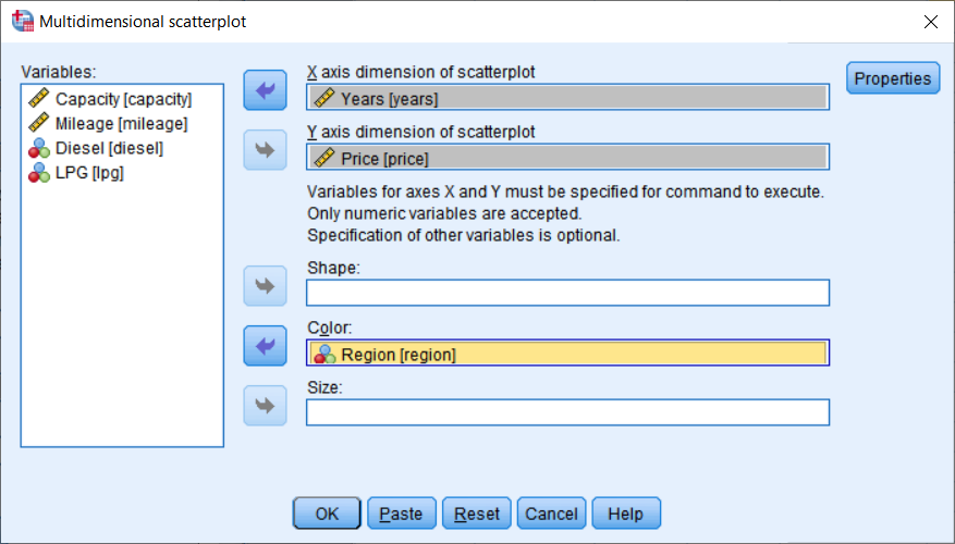
Figure 3. Multi-dimensional scatterplot wizard
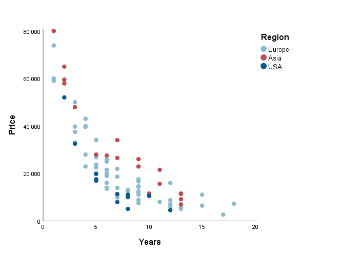
In the example below, I have chosen Region as the color variable. The variable describes the vehicle model’s country of origin.
Figure 4. Relationship between age and price subject to the country of origin
The cars on offer include European, Asian and American models (here we ignore the actual location of the corporation and actual country of production). We notice an interesting relationship: Regardless of age, Asian cars generally have higher prices than vehicles of the same age from other parts of the world. Interestingly, American cars are generally valued slightly lower, so if we are looking for “just a car” and look only at price and the year of production, we can save some money by choosing an American car. Let’s now look deeper into the reasons for such a pricing strategy.
ADDITIONAL QUANTITATIVE VARIABLE ON THE SCATTERPLOT
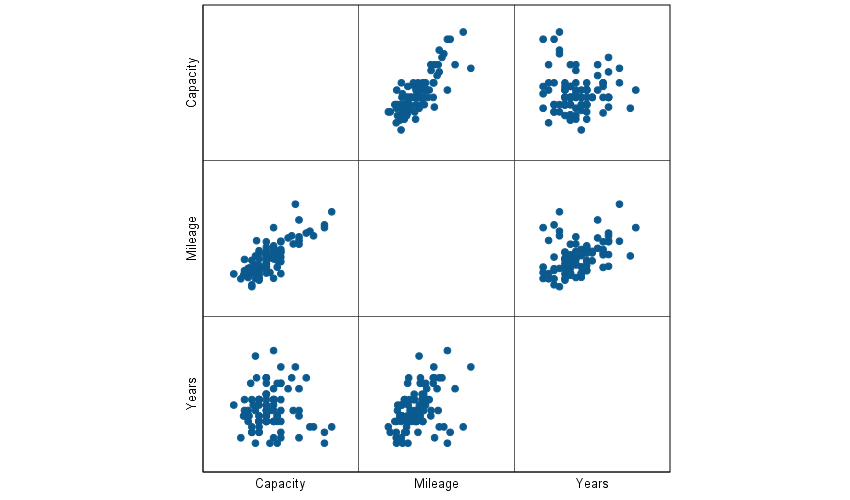
Let’s now analyze the vehicles’ mileage. This is one of key elements when evaluating the wear level of the car being bought. In general, vehicle mileage is dependent on its age, though of course there are additional factors that can affect this relationship. For example, let’s take the car’s intended use: company cars are used more extensively than private cars or cars serving as the second vehicle in a household. In our data set we do not have information about the usage of the vehicle by the previous owner. However, we have the variable with information about engine capacity, so let’s try to formulate a hypothesis that the car’s engine capacity will also affect mileage, regardless of age. Vehicles with large engines, often better equipped and simply more expensive, will more often than not serve as the first car in a household, or as a company car, which, in turn, will result in the vehicle’s higher mileage. In addition, cars with larger engines are more often bought by automotive enthusiasts, who simply drive more. Vehicles with large engines are also frequently large cars, proving better on longer journeys. All this may result in such cars being used more than small urban vehicles. Let’s analyze the relationship between these three variables using the matrix scatterplot available in PS IMAGO PRO (menu Graphs > Legacy Dialogs> Scatter/Dot).
Figure 5. Matrix graph: relationship between age, mileage and engine capacity
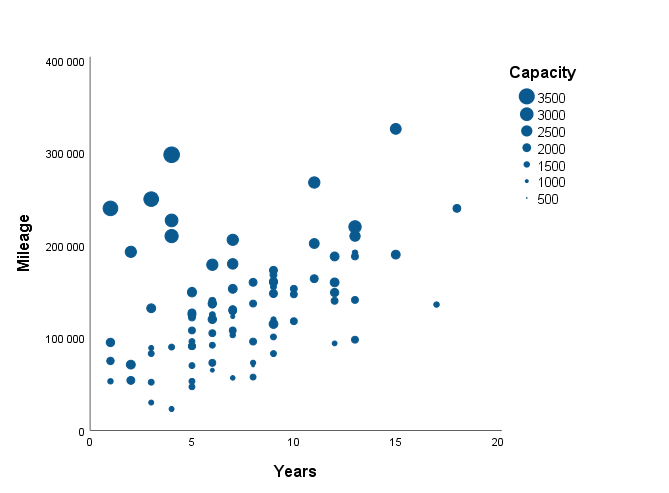
To illustrate the relationship of the variables being discussed using a single graph, let’s use the Multi-dimensional scatter graph again. This time, let’s move the Capacity variable to the Size field, with the Years variable on the X-axis and the Vehicle Mileage variable on the Y-axis.
Figure 6. Relationship between age, mileage and engine capacity
To sum up: The additional visualization has allowed us to quickly find subsequent characteristics affecting vehicle price. [Multidimensional scatterplot] available in PS IMAGO PRO allows you to easily present multidimensional relationships between variables. It can be used both as an interesting form of visualization as well as being a useful tool to support an analyst working with multidimensional techniques.

