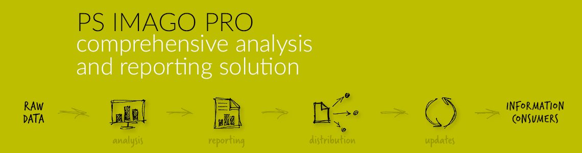
Overview of PS IMAGO PRO Add-Ons
DATA

Data Description
Creation of a data dictionary for selected variables in IBM SPSS Statistics Syntax Editor or IBM SPSS Statistics Viewer report window.
The procedure PS VARIABLES DICTIONARY describes selected variables by the relevant syntax or creates a list of all properties of the selected variables in the report window.
Application: Preparation of data for analysis, e.g. for retrieving text data and describing it with a set of commands prepared using another data set.
Create global lables
Use this dialogue box and this procedure to create global labels for selected variables.
This procedure is useful when generating result objects. It facilitates parametrisation of descriptions of charts, tables, and other result objects with labels of variables stored in the form of macros. For example, if you want to generate a table, which title automatically displays the label of the Product variable, you can use its globally stored label.
Copy value labels
Use this dialogue box and this procedure to assign labels to a selected variable based on values or labels of a source variable.
This procedure is useful for preparation of data for analysis. It can be used to copy value labels from one variable to another. This procedure can be employed in several ways.
The procedure can be used to overwrite existing labels, merge existing labels with new ones, or fill in missing labels in a target variable. The procedure can be employed, for example, after a variable is recoded into another variable or when descriptions for values (codes) are in a separate variable.
Data inventory
Use this dialogue box and this procedure to find data files of the IBM SPSS Statistics application in a selected folder and its subfolders, optionally using regular expressions to define names of the searched files.
The PS FILES INFO procedure allows you to obtain a comprehensive description of IBM SPSS Statistics application data files in the SAV format. The data description in the form of a report contains all the information on the data file (e.g. creation date, label, number of data records etc.), information on variables (e.g. position in the file, label, measurement level etc.) and a list of labels of variables’ values.
By default, the PS FILES INFO procedure searches for all SAV files in a given folder and its subfolders and generates a report on the content of the found data files.
Delete variable duplicates
Use this dialogue box and this procedure to find or delete variables that are duplicates of other variables. A variable duplicate is a variable which, for each observation, assumes the same values as the variable it is compared to. System and user defined missing values are interpreted as one and the same value and taken into account as one value during verification whether a given variable is a duplicate.
This procedure is useful for preparation of data for analysis. It limits the data file size by deleting variables that have no value for the analysis. Variables with different names that are duplicates of other variables in terms of assumed values do not contribute to the analysis.
The PS DELETE DUPLICATES procedure verifies whether variables assume the same values. Duplicates can be physically deleted from the dataset. It is also possible to only create a report with information which variable assumes exactly the same values. The check report after duplicates are found is displayed in the Log object of the IBM SPSS Statistics Viewer report window.
Delete constant variables
Use this dialogue box and this procedure to find or delete variables with constant values in the data file. If at least one observation assumes a value different from the others, the variable is not deemed a constant. System and user defined missing values are interpreted as one value and taken into account during verification whether a given variable is a constant.
This procedure is useful for preparation of data for analysis. It limits the dataset size by deleting variables that have no value for the analysis. Variables with constant values do not contribute to the analysis.
The PS DELETE CONSTANTS procedure checks whether variables assume constant values and physically deletes them from the dataset. It can also report the presence of such variables. The check report after a constant is found is displayed in the Log object of the IBM SPSS Statistics Viewer report window.
Create calendar
Use this dialog box and this procedure to create a new dataset and in the next step to create new cases in it. The procedure adds the following daily date to each case, starting from initial to final date, both of which have been previously defined. The number of cases equals the number of days between the dates mentioned before.
The procedure is useful at the stage of data preparation. One can frequently find missing values, breaks or gaps in processes observed during a long period of time. As a result of that proper analysis and visualization can be difficult.
The PS CALENDAR procedure creates a dataset with continuous dating series thereby filling in any gaps in the time series. After that the new data can be added from the other file after proper transformation (for example aggregation).
TRANSFORM
Recode infrequent categories
Use this dialogue box and this procedure to recode a variable into a new variable with smaller number of categories by merging infrequent categories. Categories of the new variable can be merged into the “Other” category depending on their count or per cent ratio of observations in a given category.
This procedure is useful for preparation of data for analysis. It can be used to calculate simplified variables for the purpose of analysis and visualisation of results. For example, if there is a variable with many infrequent categories, you can decide to merge all categories with less than 2% of observations into one category: “Other”.
Normalization of variables
Use this dialogue box and this procedure to scale selected ordinal or quantitative variables with standardisation or min-max normalisation. Values of variables that are scaled are transformed so that the resulting variable has a user-specified mean and standard deviation (standardisation) or minimum and maximum (min-max normalisation).
This procedure is useful for preparation of data for analysis. It facilitates reducing multiple variables to a common range, which is an important step
Multiple response sets coding
Use this dialogue box and this procedure to transform a set of variables of multiple responses coded as categories into a set of dichotomies or vice versa.
This procedure is useful for preparation of data for analysis. It can be used to change the coding of multiple choice question variables. As a result of the procedure, a new set of variables is created in the data editor window. The original set of variables remains unchanged.
Recode categories monotonically
Use this dialogue box and this procedure to recode a variable into a new variable with its categories ordered by frequency. Categories of the new variable can be ordered: in the ascending order: with the category with the lowest count in the beginning; or in the descending order: from the largest observation count category to the smallest one.
This procedure is useful for preparation of data for analysis. It can be used to order categories in variables for the purpose of analysis and visualisation of results. For example, if you want to have categories of a nominal variable ordered by frequency in tables and charts, you can use the monotonic recoding procedure.
Compute global values
Use this dialogue box and this procedure to calculate summary statistics for selected variables, such as mean, median, sum, minimum, maximum, standard deviation, number of cases, unweighed number of cases, first value, last value. Selecting additional options saves the summary statistics to the data as new variables or to the dictionary that describes the data file as user attributes.
This procedure is useful for preparation of data for analysis. It can be used to calculate new variables using existing global values. For example, to calculate the per cent ratio of sales of a given observation to total sales, you can use calculated total sales stored as a global value.
Dichotomous coding
Use this dialogue box and this procedure to create new dichotomous variables based on the value of any variable in the IBM SPSS Statistics Data Editor window.
ANALYZE

Cramer’s V correlated variables
Use this dialogue box and this procedure to check and report the strength of correlation for a set of independent variables crossed over with a dependent variable. The procedure results in a table and a chart with the value of Cramer’s V correlation for independent variables measured an nominal and ordinal levels in relation to a selected dependent variable.
This procedure is useful for data analysis. It can be used for quick verification of correlation of a set of independent variables with a selected dependent variable. It facilitates quick selection of independent variables for cross tables with a dependent variable. Further analysis of the variables
Inequality measures
Use this dialogue box and this procedure to calculate and report selected measures of income inequality.
This procedure can be used to compare multiple quantitative variables that take on non-negative values or compare values of one such variable divided into categories determined by a qualitative dividing variable. The Inequality Measures procedure can generate the following result objects: Lorenz curve with cumulative distribution of income, Data table for Lorenz curve, and Table with selected indices of inequality.
Cluster evaluation
Use this dialogue box and this procedure to evaluate groups.
This procedure can be used to assess the quality of observation grouping. The Group Evaluation procedure can generate the following result objects: Total Silhouette value, Descriptive statistics for Silhouette, Silhouette value distribution by group, Group centroid distance, and Observation to group centroid distance. Moreover, the procedure can be used to generate and store in a data set variables with Silhouette value for each observation, the distance of observations to the centres of individual groups, and the identifier of the closest cluster for further analysis.
The Silhouette coefficient merges the concept of group cohesion (favouring cohesive groups) and their partitioning (favouring groups well partitioned from other ones). It can be used to evaluate individual observations, groups, and models.
Significant variables Chi-squared
Use this dialogue box and this procedure to check and report the significance level for a set of independent variables crossed over with a dependent variable. The procedure results in a table with chi-squared independence test significance levels for independent variables measured on nominal and ordinal levels in relation to a selected dependent variable.
This procedure is useful for data analysis. It can be used for quick verification of significance levels of a set of independent variables in relation to a selected dependent variable. It facilitates quick selection of independent variables for cross tables. Further analysis of the variables selected by the Significant variables Chi-squared procedure provides the means for better understanding of their relations.
Significant variables CHAID
Use this dialogue box and this procedure to check and report the significance level for a set of independent variables crossed over with a dependent variable. The results of the procedure are: a table with chi-squared independence test significance levels for independent variables and a cross table showing the relations between the dependent variable and the set of independent variables. Independent variables used to test the relations are first recoded to “enhance” the strength of the dependence on the dependent variable. The procedure uses the CHAID algorithm available in the Decision Tree module.
This procedure is useful for data analysis. It can be used for quick verification of significance levels of a set of independent variables with a selected dependent variable. It can also be used to recode independent variables’ categories automatically.
GRAPHS

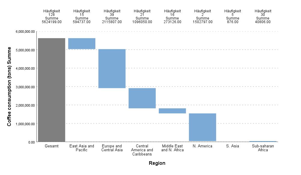
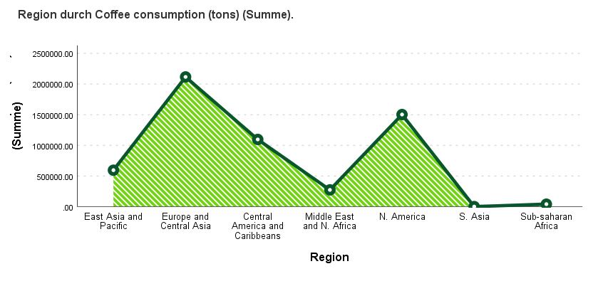
Waterfall graph
Use this dialogue box and this procedure to create a Waterfall Chart for a nominal or ordinal variable in the report editor window. The Waterfall Chart is a bar chart in which the bars are located in reference to the y-axis depending on the location of the previous bar. Each consecutive bar begins at the end value of the previous bar. The aggregate value is shown with a Total bar. The bars may represent the size for a primary variable category or totals for a quantitative variable.
The Waterfall Chart is usually used to help understand the contribution of individual elements into the aggregate result. It shows what part of the total value is provided by individual categories of the variable. It can also be used to present the aggregate result of consecutive positive or negative values. Positive and negative values are in different colours.

Violin plot
Use this dialogue box and this procedure to create a Violin Plot in the report editor window. The plot is used to visualise distribution of quantitative data and probability density.
It is based on a symmetrical density plot presented in relation to the vertical y-axis and on additional elements that make it similar to the boxplot.
The plot may show markers of the median or quartiles. The Violin Plot is a good chart for comparing variable distribution.
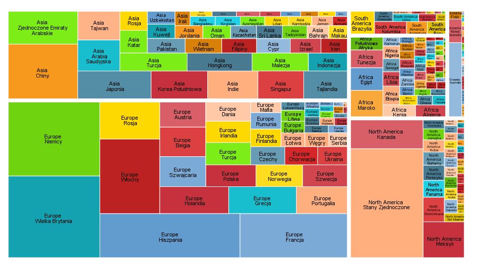
Treemap
Use this dialogue box and this procedure to create a Tree Map in the report editor window. It is a mosaic plot whose surface is divided into segments depending on group statistics. The surface area of each segment is proportional to its share in the total size. If an optional quantitative variable Values is introduced, the surface area of a segment can be modified with the variable sum percentage. Segments may be coloured with an optional target variable.
This type of chart has functions for describing leaf nodes using the classification tree technique.
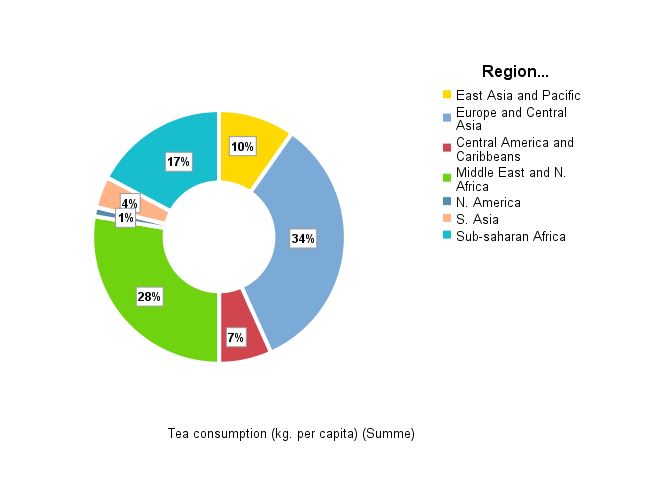
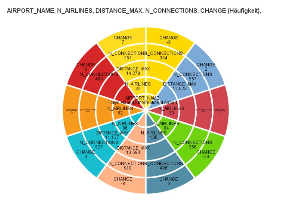
Ring Chart
Use this dialogue box and this procedure to generate a stacked ring chart in IBM SPSS Statistics Viewer report window.
This chart is an enhanced version of the simple ring chart showing count for qualitative variable categories in per cent in the form of ring segments. Juxtaposition additionally divides the chart into rings representing categories of a different qualitative variable. Variables statistics for stacked ring chart (count of the variable used to create segments or sums of values of the summarised variable) are then calculated for each ring (juxtaposing variable category) separately. Pie chart is usually useful for comparing proportions. It is the best for visualising data as a part of a whole. Whereas a Stacked ring chart introduces an additional dimension to the comparison. Length of the arc of each segment in a pie chart (and its central angle as well as the surface area it creates) is proportional to the quantity it represents. The same applies to segments of all stacked ring chart rings.
Series graph
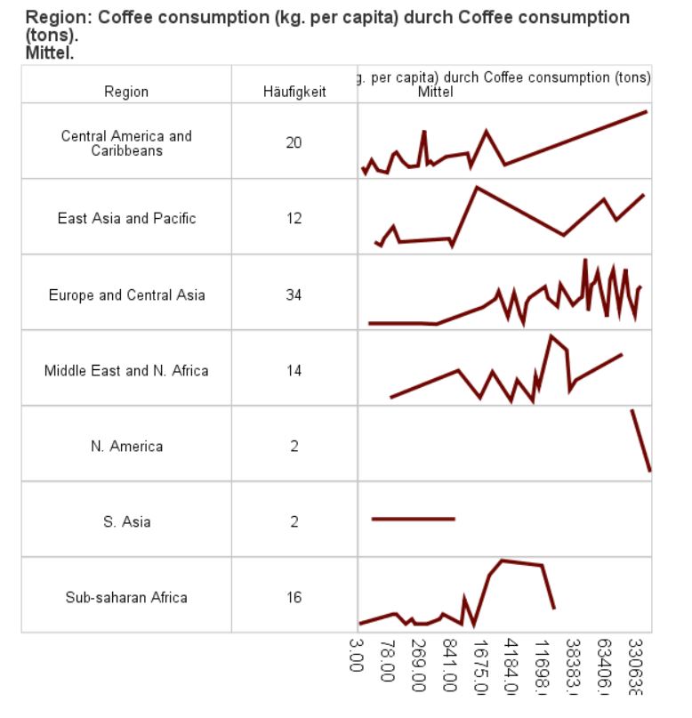
Use this dialogue box and this procedure to create a Series Plot in the report editor window and add more dimensions to the plot with an additional quantitative variable on the y-axis, a colour variable measured nominally or ordinally, or a variable with information whether an event took place.
The Series Plot is a type o linear or layered plot most often used to represent changes in time. The chart may represent size for primary variable category or statistics for a selected quantitative variable. The colour variable can be used to juxtapose layers or divide layers into segments (such as quarters). The event variable can be used to represent in the chart vertical lines when an important event took place (such as placing a new product on the market, commencement of a marketing campaign, etc.).
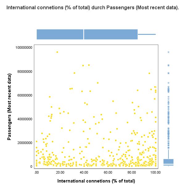
Scatterplot and Distribution Graph
Use this dialogue box and this procedure to create a scatter (dispersion) plot for two numeric variables with a distribution graph for both variables in IBM SPSS Statistics Viewer report window.
By using the PS GRAPH SCATTERDISTRIBUTE procedure, one graph shows information concerning relative positions of values of the two numeric variables in two-dimensional space (X, Y) and information on the distribution of the variables. Scatterplot is the primary graph. It is useful for establishing potential relations between quantitative variables. Auxiliary graphs, showing the distribution of variables, are in the form of a boxplot or histogram. Histograms are useful for visualising the distribution of quantitative variables. Data is divided into intervals and summarised by size or percentage. Boxplot presents five statistics describing the distribution of a variable: the minimum, the lower quartile, the median, the upper quartile and the maximum. It is useful for presenting the distribution of quantitative variables and identifying outliers.
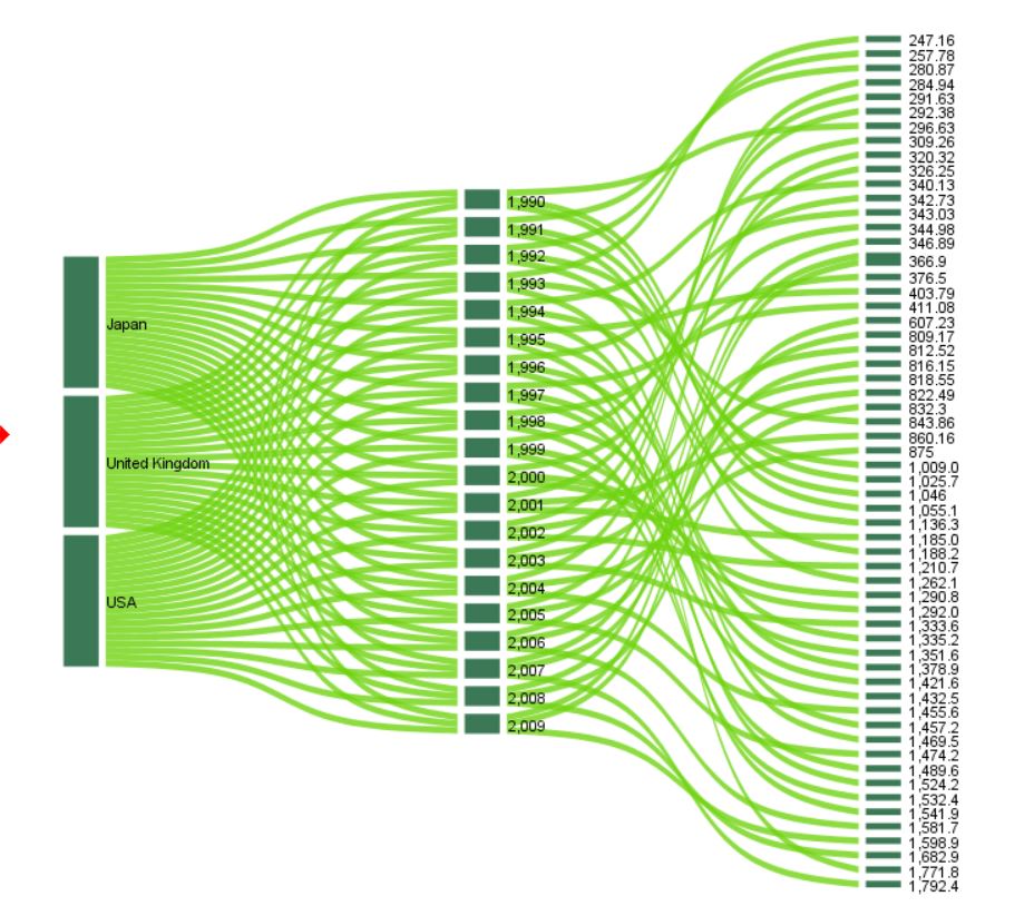
Sankey Diagram
Use this dialogue box and this procedure to create a Sankey Diagram in the report editor window.
The diagram is used to illustrate relations between specific categories of variables. It is composed of two groups of elements – nodes (bars) presenting categories, and links (flows) illustrating relations between categories.
The size of nodes and links corresponds to the number or sum of an indicated quantitative variable. Connections may be colored using the optional Color variable.
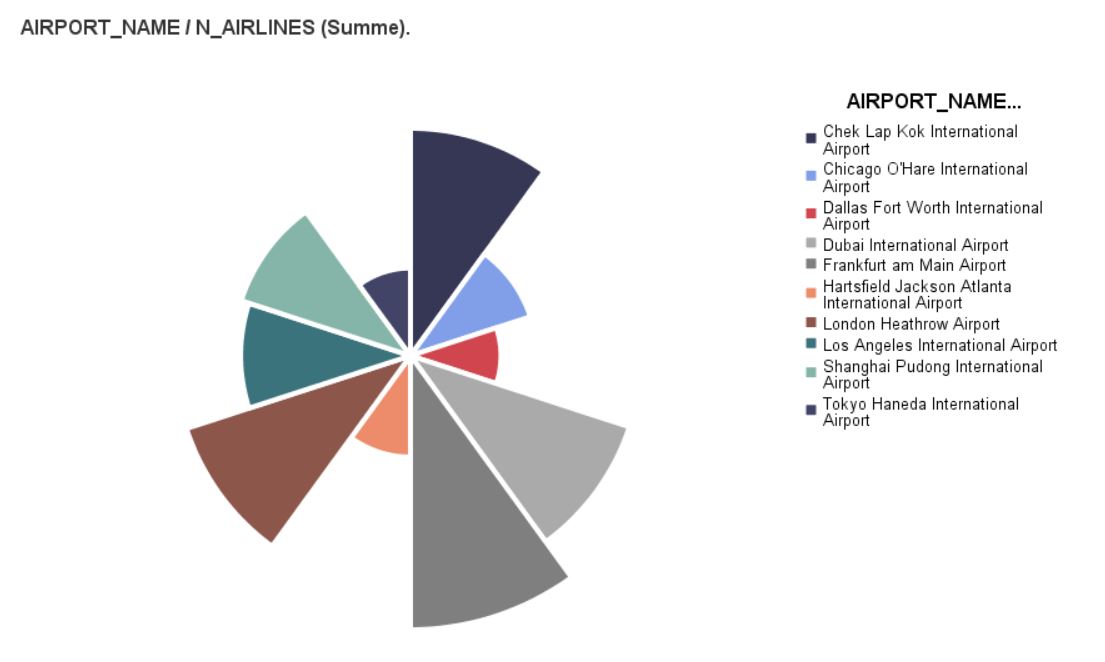
Nightingale-Rose
Use this dialogue box and this procedure to generate a Nightingale Rose chart in IBM SPSS Statistics Viewer report window.
This chart is a variation of a juxtaposed bar chart presented in a polar coordinate system. A chart similar to the pie chart is created. Its circular segments have the same angles but different radii.
The analytics has one more data visualisation tool thanks to Florence Nightingale, an intelligent and well educated nurse who published her rose diagram in 1858. Due to the fact that each segment has the same angle and variable values are represented by the length of radii, this diagram is a suggestive visualisation particularly useful for occurrences happening over time (like births in individual months). The division into segments is achieved with qualitative variable categories. The length of the radius represents the count of individual categories of the variable which creates the segments or the mean or sum of values of another quantitative variable. The Nightingale Rose diagram can be additionally divided into rings representing categories of a different qualitative variable. Statistics are then calculated separately for each segment of the rings.
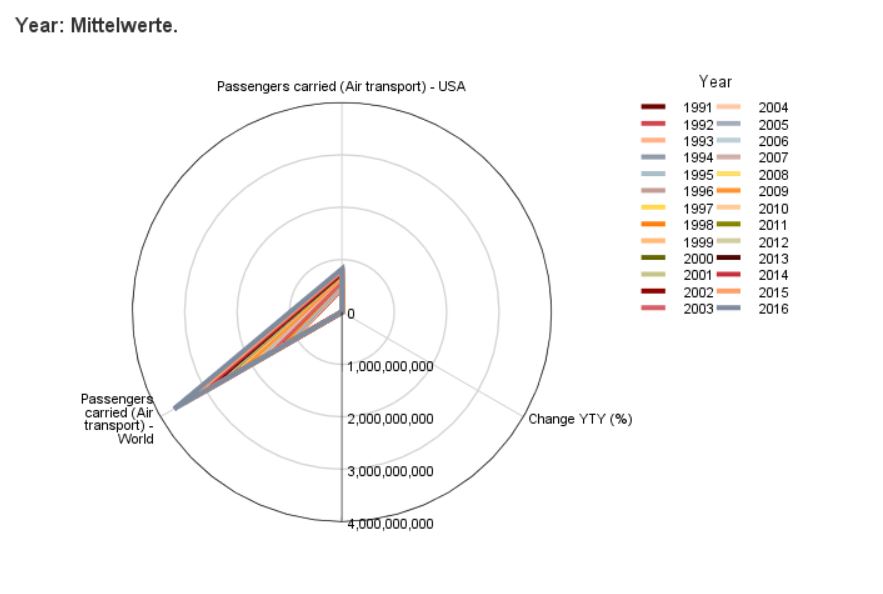
Radar Chart
Use this dialogue box and this procedure to generate a Radar Chart in IBM SPSS Statistics Viewer report window.
This chart can be used to show values of summaries of multiple quantitative variables by assigning one variable to each axis in a polar coordinate system and drawing a line through points that correspond to values of individual summaries.
Optionally, it is possible to add a qualitative dividing variable, which causes summary values to be calculated in groups isolated based on categories of this variable. Then, lines representing each category are in different colour in the chart.
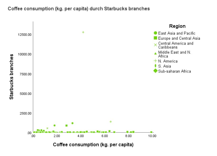
Multidimensional Scatterplot
Use this dialogue box and this procedure to generate a simple scatter (dispersion) plot for two numeric variables and include additional dimensions represented in the chart by the size, shape and colour of symbols used in the scatterplot in IBM SPSS Statistics Viewer report window.
By using the PS GRAPH MULTISCATTER procedure, one graph shows information concerning relative positions of values of the two numeric variables in two-dimensional space (X, Y) and a representation of values (categories) of the other variables (usually qualitative variables) in the additional dimensions.
Scatterplot is the primary graph. It is useful for establishing potential relations between quantitative variables. Information for the additional dimensions can be used to establish additional correlations between the variables. The differentiation of points in the XY space by using different colours, sizes and shapes of markers enables the user to compare several correlations by representing them on a single chart with one scale system for all values. It is a useful tool for e.g. establishing a non-apparent structure of factors or dimensions in a discriminant analysis.
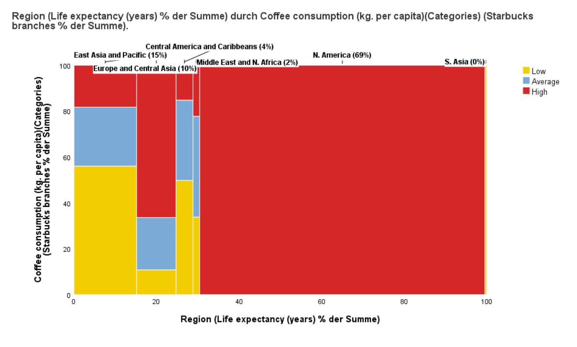
Marimekko Chart
Use this dialogue box and this procedure to generate a Marimekko Chart in IBM SPSS Statistics Viewer report window. This type of chart is a 100 percent stacked chart in which the width of a bar is proportional to its share in the total value. The height of an individual segment set apart with a colour variable depends on its percentage contribution to the respective bar total value. Optional quantitative variables facilitate modifying bar width (qualitative variable X) and/or segment height (qualitative variable Y) using the percentage of the sum of the variables.
This type of chart is used to compare proportions (sizes or sums) in nested qualitative data. For example, it presents the contribution of revenues for product lines in different regions of the world for a production company.
The Marimekko chart is perfect for graphic representation of cross tables.
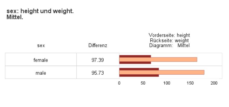
Layered Bar Chart
Use this dialogue box and this procedure to generate a layered bar chart in IBM SPSS Statistics Viewer report window. This chart shows differences between values of statistics (mean or sum) for two quantitative variables or differences between values of statistics for one quantitative variable and a set value (constant) divided into nominal variable categories.
The PS GRAPH LAYEREDBOXES shows information on the comparison of mean values of two variables aggregated within a category of an interval variable (X axis) on a layered bar chart. This type of chart is perfect for comparing two quantitative variables that represent the same indicator in two periods of time within a category of a qualitative variable; for example, comparing last year’s and current sales in individual months of the first two quarters.
Hierarchical graph
Use this dialogue box and this procedure to create a Hierarchical Chart in the report editor window. This type of chart is perfect for representing hierarchical data, which can easily be shown on various levels of aggregation (for example data for schools and classes). It can present simultaneously up to five levels of hierarchy if you use the dialogue box and up to ten with the Syntax language.
In the Hierarchical Chart, the length of the edge of each element is proportional to the share of the category in the total size of the Basevariable. If you introduce an optional quantitative variable Values, its sum percentage can be used. Components of the chart may be coloured with an optional target variable.
The chart may be created using the polar coordinate system (modes Flares and Flares (reversed)) or in the Cartesian coordinate system (modes Icicles and Icicles (reversed)).
This type of chart can be used to present a structure of a decision tree and the values it anticipates, for example.
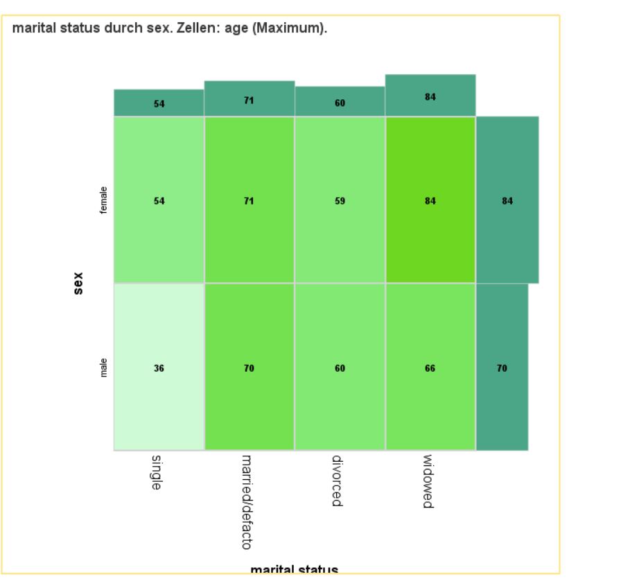
Heatmatrix Bars
Use this dialogue box and this procedure to present summaries of a quantitative variable within groups isolated based on categories of two qualitative variables with a heat map with summary map at the border. Additionally, you can add cell and bar labels to provide the map with cross table features.
This procedure generates a summary map, which illustrates summaries for a qualitative variable within groups that result from a crossover of categories of two qualitative variables. It combines advantages of a heat map and a cross table. Selected statistics for the quantitative variable are represented in summary map cells by colour intensity and labels (optionally). Additionally, there are bar charts representing the marginal value of the selected statistic at the borders of heat map.
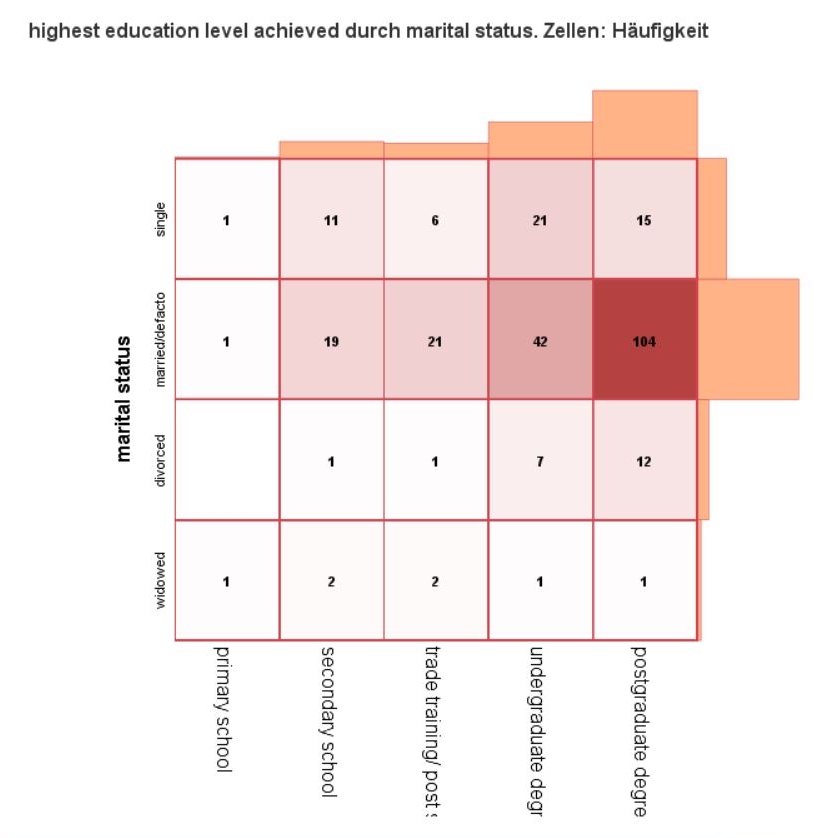
Contingency Map
Use this dialogue box and this procedure to show two qualitative variables with a heat map with boarder count bar charts. Additionally, you can add cell and bar labels to provide the map with contingency table features.
The procedure generates a contingency map visualising two qualitative variables with the best features of heat map and contingency map. Selected statistics are represented in contingency map cells by colour intensity and labels (optionally). Additionally, there are bar charts representing the marginal distribution of the variable at the borders of heat map.
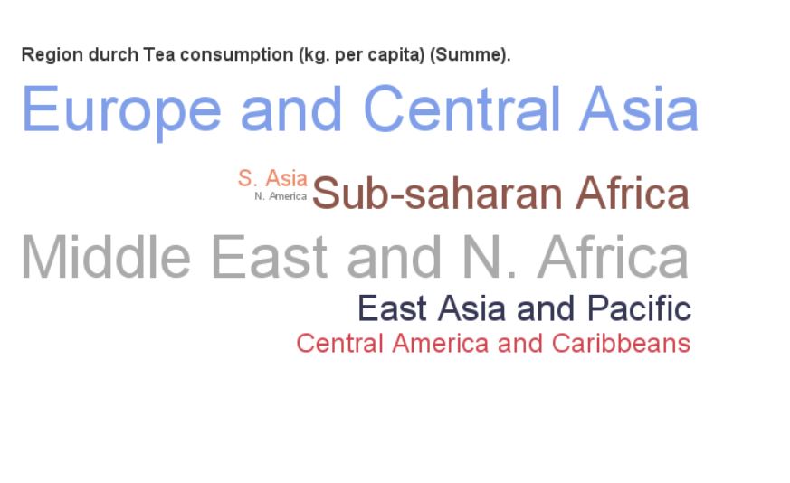
Cloud
Use this dialogue box and this procedure to present data in the form of a word or bubble cloud. The more often a given numerical or textual variable category occurs, the larger the word or circle will be.
Alternatively, the procedure allows to differentiate between word and circle sizes based on the sum of another quantitative variable. It is also possible to use an additional color variable whose dominant, mean or sum will control the color of the item.
GRAPHS – Table

Series
Use this dialogue box and this procedure to present time series charts in a table. Decide what statistic is to be displayed in a line, line with points, bar or layered chart. Additionally, select any number of the available statistics to be shown in table columns and decide whether table cells with statistics are to be coloured.
This procedure is useful when you need to present a summary of a quantitative variable in time with division into groups. This feature offers the advantages of both charts and tabulated summaries.
This procedure generates a table whose rows are determined based on categories of the variable in the Grouping variable field. The columns of the table contain label or grouping variable category code, statistics selected by the user, and a selected type of chart created based on the series variable (X axis) and analysed variable (Y axis), respectively.
Layered
Use this dialogue box and this procedure to present layered bar charts in a table. Decide what statistic is to be displayed in the bar chart. Additionally, select any number of the available statistics to be shown in table columns and decide whether table cells with statistics are to be coloured.
This procedure is useful for comparing summaries of two quantitative variables divided into groups with additional summaries to be shown in table cells. This feature offers the advantages of both charts and tabulated summaries.
This procedure generates a table whose rows are determined based on categories of the variable in the Grouping variable field. The columns of the table contain label or grouping variable category code, statistics selected by the user, and a layered bar chart, respectively.
Histogram
Use this dialogue box and this procedure to present histograms in a table. Decide whether the presented histogram is to be divided as per colour variable. Additionally, select any number of the available statistics to be shown in table columns and decide whether table cells with statistics are to be coloured.
This procedure is useful when you need to present the distribution of a quantitative variable on a histogram with additional summaries. This feature offers the advantages of both charts and tabulated summaries.
Error Bars
Use this dialogue box and this procedure to visualise error bars in a table for the mean of an analysed variable in groups created by values of another variable. Additionally, select any number of the available statistics to be shown in table columns and decide whether the median is to be shown in the error bar chart too.
This procedure is useful for presenting distribution of quantitative variable divided into groups with additional summaries. This feature offers the advantages of both charts and tabulated summaries.
Box
Use this dialogue box and this procedure to visualise boxplots in a table for an analysed variable in groups created by values of another variable. Additionally, select any number of the available statistics to be shown in table columns and decide whether the mean is to be shown in the boxplot too.
This procedure is useful for presenting distribution of quantitative variable divided into groups with additional summaries. This feature offers the advantages of both charts and tabulated summaries.
Bar
Use this dialogue box and this procedure to present bar charts in a table. Decide what statistic is to be displayed in the bar chart. Additionally, select any number of the available statistics to be shown in table columns and decide whether table cells with statistics are to be coloured.
This procedure is useful for presenting count or group count percentage or statistics for a quantitative variable divided into groups with additional summaries. This feature offers the advantages of both charts and tabulated summaries.
DASHBOARD

Dartboard
Use this dialogue box and this procedure to visualise in a dashboard a comparison of an index in groups determined with categories of a qualitative variable.
The PS DASHBOARD DARTBOARD procedure shows results in the form of a dartboard. Individual categories are represented by points. The closer a category is to the centre of the dartboard, the higher the value of the coefficient.

Arrows & Traffic Lights
Use this dialogue box and this procedure to visualise in a dashboard a result of an index in groups determined with categories of a qualitative variable. The PS DASHBOARD ARROWS procedure presents a result in the form of arrows or traffic lights. In the Arrowsmode, an arrow is displayed for each category. Its angle of inclination (and colours, if used) will depend on the value of the Values variable.
This type of visualisation is of particular use for showing a change of value between two points in time. In the Lights mode, an object resembling traffic lights will be shown for each category. If the light on the left-hand side is on, the value for the category is wrong; the middle light means an average result; and the right-hand side light, a good result.
DASHBOARD -Percentage of Target

Gauge
Use this dialogue box and this procedure to display the degree of completion of a target in groups in a dashboard. The PS DBSIMPLE GAUGE procedure compares actual values of completion of a task with target values and displays the results in the form of a slider or pointer gauge. Above the gauge, there is information on the name of the category for which the value is shown (e.g. product, month, branch, SKU) and below it or inside, the actual value to target value ratio in per cent (e.g. 110%) is displayed.
Thermometers
Use this dialogue box and this procedure to display the degree of completion of a target in groups in a dashboard. The PS DBSIMPLE THERMOMETERS procedure compares actual values of completion of a task with target values and displays the results in the form of a thermometer. Below each thermometer, there is information on the name of the category for which the value is shown (e.g. product, month, branch, SKU) and above it, the actual value to target value ratio in per cent (e.g. 110%) is displayed.
Bars
Use this dialogue box and this procedure to display the degree of completion of a target in groups in a simplified dashboard. The PS DBSIMPLE BULLET procedure compares actual values of completion of a task with target values and displays the results in the form of a bar chart. Consecutive columns of the table include: name of category in the aggregate, values of selected statistics for the category, and bars that show percentage values of target completion.
Bricks
Use this dialogue box and this procedure to display the degree of completion of a target in groups in a simplified dashboard. The PS DBSIMPLE BRICKS procedure compares actual values of completion of a task with target values and displays the results in the form of a brick chart. The lower part of the graphic contains information on the name of the category for which the value (e.g. product, month, branch, SKU) and nominal actual value (e.g. number of products sold of sales value in PLN) are displayed and the upper part – actual value to target value ratio in per cent (e.g. 110%).
DASHBOARD -Percentage of Target – Threshold

Thermometers
Use this dialogue box and this procedure to display the degree of completion of a target in groups in a dashboard. The PS DASHBOARD THERMOMETERS procedure compares actual values of completion of a task with target values and displays the results in the form of a thermometer. Below each thermometer, there is information on the name of the category for which the value is shown (e.g. product, month, branch, SKU) and above it, the actual value to target value ratio in per cent (e.g. 110%) is displayed.
Gauge
Use this dialogue box and this procedure to display the degree of completion of a target in groups in a dashboard. The PS DASHBOARD GAUGE procedure compares actual values of completion of a task with target values and displays the results in the form of a slider or pointer gauge. Above the gauge, there is information on the name of the category for which the value is shown (e.g. product, month, branch, SKU) and below it or inside, the actual value to target value ratio in per cent (e.g. 110%) is displayed.
Bars
Use this dialogue box and this procedure to display the degree of completion of a target in groups in a dashboard. The PS DASHBOARD BULLET procedure compares actual values of completion of a task with target values and displays the results in the form of a table bar chart. Table columns contain information on the name of the category for which the value (e.g. product, month, branch, SKU), nominal actual value (e.g. number of products sold of sales value in PLN) and actual value to target value ratio in per cent (e.g. 110%) are displayed.
REPORT

Output actions
Use this dialogue box and this procedure to modify the structure of the report in IBM SPSS Statistics Viewer window.
You can use the PS SELECT OUTPUT procedure to change the visibility (Show/Hide) of report elements or remove them completely (Delete). The default action on report elements is selecting (Select) in the report structure.
Each action can be performed for elements selected according to certain criteria. In this dialogue box, you can specify individual types of report elements (Selected output objects) to undergo a specific action (Output actions) which is also selected in this window. You can also specify additional selection criteria: a condition matching a given text to texts in report elements’ description (Description of an object contains text).
Insert image
Use this dialogue box and this procedure to insert an image file to the report editor window.
With the PS INSERT IMAGE procedure you can insert a *.gif, *.jpg, or *.png file into your report. By default, the object title shown in the object tree is the name of the most recent inserted file. It can be replaced with a custom title. Operations will be applied in the selected report window.
Footnotes statistics
Use this dialogue box and this procedure to modify frequency tables in IBM SPSS Statistics Viewer report.
The PS FOOTNOTES STATS procedure enables you to modify frequency tables by adding statistics values calculated in the Statisticstable to their footnotes. Statistics tables are generated for each Frequencies procedure’s result.
By default, statistics in all Statistics tables in the
Table Colouring
Use this dialogue box and this procedure to modify the appearance of tables in IBM SPSS Statistics Viewer report.
The PS COLOR TABLE procedure can be used to modify the appearance of a single table or a group of selected tables.