Written by Anna Huculak (Predictive Solutions)
THE DARTBOARD VISUALIZATION IS ANOTHER USEFUL MEDIUM FOR PRESENTING THE RESULTS OF ANALYSES ON A DASHBOARD.
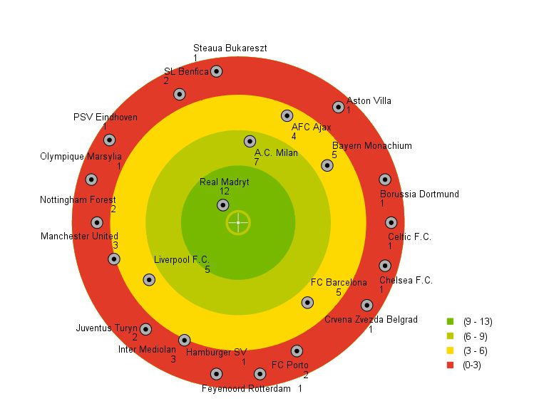
In this article, we will use this visualization to present the achievements of the best soccer clubs in Europe, using as a basis the number of victories in the Champions League in the years 1955-2017. [1]

Victories in the Champions League 1955-2017
As we can see in Fig 1, the result is presented in the form of a dartboard where individual teams are represented by points. The closer the team is to the center of the target, the more Champions League titles it has won in its history. The undisputed leader is Real Madrid, which won as many as twelve editions of the competition. A great result is also visible for A.C. Milan, with seven wins to its credit. In the lead group there are also Bayern Munich, FC Barcelona and Liverpool F.C. (5 wins each) and AFC Ajax (4 wins).
The distance from the point to the center of the dartboard is easy to judge when the dartboard is divided into circles (like in a real darts game). The presence of the rings plays a very important role: the number, width and color helps determine how the report recipient interprets the results.
When designing a dartboard-type visualization, it is necessary to do everything possible to make the existing diversity of the categories as visible as possible. In particular, it is important to set the minimum and maximum values for the entire visualization. These values should be close to the values in the data. In our example, the clubs that have won the Champions League at least once are presented, and the maximum number of wins is 12. The visualization scale has therefore been set to the range from 0 to 13. Four rings were selected because such a number is sufficient to present well the differences between the clubs. The boundaries between the ranges (rings) are defined to ensure that most of the points are within the ring and not on the boundary between them. This makes it much easier to interpret the results of individual clubs. An additional option is to give names to particular ranges (“excellent result”, “very good result”, etc.) and to place them in the legend of the chart.
The color scheme of the rings also plays an important role. The presented example uses a color style referring to traffic lights, often used in dashboards because of its clear message (red – bad, yellow – medium, green – good). However, it is possible to choose more neutral colors, e.g. varying the shades of the selected color from the brightest to the darkest, or by alternating the coloring of the rings.
The dartboard visualization can present on a dashboard a comparison of any indicator in groups defined by the categories of the quality variable. The graph is readable even if the number of categories of the qualitative variable is large (in our example the results for 22 clubs were presented). One of the undeniable advantages of this visualization is that it is understandable for every recipient, and at the same time very original.
The dartboard graph is one of 50+ custom built procedures included with PS IMAGO PRO.
[1] The data came from https://pl.wikipedia.org/wiki/Liga_Mistrz%C3%B3w_UEFA; date of access: 15.12.2017
Contact us to find out more about these and all other great features of PS IMAGO PRO!

