By JOANNA SARATA (Predictive Solutions)
WHEN IT COMES TO CHARTS ‘LESS’ IS NOT NECESSARILY BETTER AND ‘MORE’ CAN OFTEN LEAD TO MORE FUNCTIONAL DATA VISUALISATION.
I am not advocating a revolution in chart architecture but encourage you to ponder a more effective use of chart space, one that will improve the informative value of the visualisation but will not upset the clarity of the message.
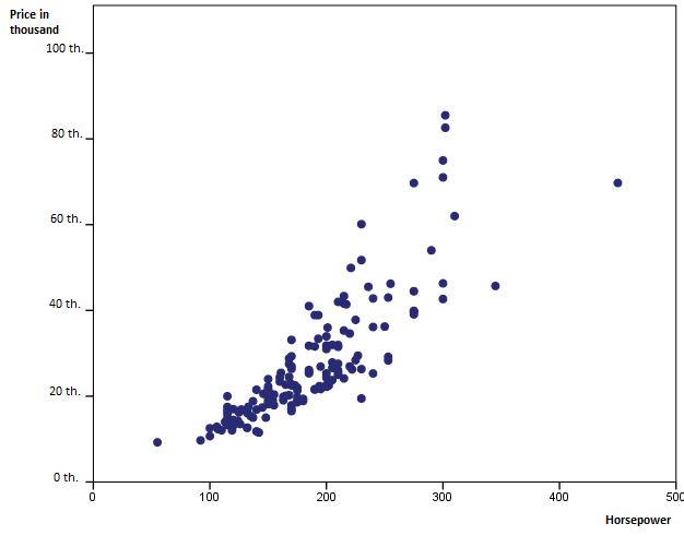
Are you planning to buy a new car? If yes, then you may be interested in the chart and example below which I believe should be clear not only to drivers. We have a dataset prepared by an analyst who is planning on buying a new car. It includes prices of individual models and engine performance data among other things.
We have a simple scatter plot with two quantitative variables. The analyst is looking into the relationship between the price of a new car and its performance measured in horsepower. This visualisation tells us that although the distribution of points suggests a non-linear relationship, in general the greater the horsepower, the more expensive the car.
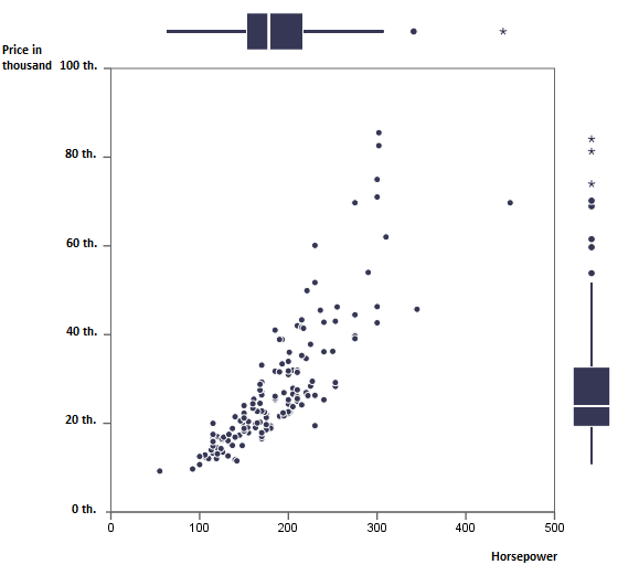
I added a representation of the distribution of both variables in the form of boxplots on their respective margins. What does it tell us? The ‘price’ variable is definitely right-skewed with 50% of observations within the 20 thousand-dollar price. This is what the box on the right margin tells us. Observations above 55 thousand dollars are outliers (marked as dots), and above 75 thousand dollars, extremes (marked as stars).
With the boxplots added, the informative value of the visualisation was improved and the outliers were made easier to identify while maintaining the clarity of the plot itself.
What is your idea for using chart margins?


